totodile through the ages!
are you interested in how totodile’s lovely design changed through the years? then look no further, because this page is for detailing the history of totodile!
i will be placing particular focus on totodile over the course of the core series pokemon games. let’s get to it!
prior to generation two
before we had totodile, there was a pokemon named kurusu, or cruise, in the 1997 spaceworld demo of pokemon: gold and silver. kurusu was meant to be the johto water starter.

this image is from the cutting room floor. it features a huge repository of information regarding the 1997 demo of gold & silver, including a massive pokedex with pokemon who were eventually cut out or reworked for the final version of pokemon: gold & silver, such as kurusu. i highly recommend checking it out.
now, kurusu is entirely different to totodile, but i think it’s important to mention it as part of totodile’s journey in development. in some alternate reality, kurusu would have been the johto starter rather than totodile! as cute as it is, i have to say that i’m glad we ended up getting totodile. (obviously, i’m totally biased.) maybe in the future, we’ll see kurusu again. i think it fits in well with lapras; maybe it can be a pre-evolution, or its entire evolutionary line can be re-introduced as a sort of ‘cousin’ to lapras!
at some point, kurusu was replaced with the very first form of totodile.

this beta totodile image is also from the cutting room floor, though this totodile was not in the spaceworld demo and would be introduced in a different pre-official release build of the game.
this totodile was where it all truly began. i have lovingly dubbed this totodile as 'pre-historic totodile.' it has a lot more markings on its head, jaw, chest and stomach. thanks to that jaw marking, its face in particular bears arguably closer resemblance to its future evolutions. it would make a great paradox pokemon, in my opinion!
generation two
prehistoric totodile’s design would be tweaked for the final version of pokemon: gold and silver. we got different totodile sprites for each game!


now this is what it’s all about. this is the iconic totodile who has captured hearts and minds across the world. its sprites are different between pokemon gold (left) and pokemon silver (right), but both are extremely charming and full of personality. gold’s sprite captures totodile’s iconic maw, while silver’s sprite shows totodile doing a little playful dance and waving at us. o/

here are totodile’s back sprites, too. they’re the same between versions despite silver-totodile’s mouth being more closed. i guess it couldn’t resist showing off its powerful teeth after all! note the smaller, unspiked ridge next to the main spiked one going down part of totodile’s back. there is another one of those on the other side of the spikes, making 3 in total.
following gold and silver, we got pokemon: crystal version. (fun fact: crystal is my favorite pokemon game of all time!) with pokemon crystal, all of our minds were blown, as we finally got… animate pokemon sprites!


LOOK AT THEM GO. totodile gained the power to full-on dance and snap its little jaw at us. while these sprites definitely took more inspiration from pokemon: silver’s totodile sprite, i think the little jaw-snap is very reminiscent of pokemon: gold’s sprite. this is great for the shiny totodile, as it can show off its purple mouth. it's also interesting how totodile is a slightly darker shade overall in crystal, and it shows one less tooth in its static position after doing its little dance animation. (i guess it decided to put its molar away!) crystal version's totodile also has smaller, smoother spikes. most notably, the one by its head has moved down a bit, and the one on its tail is more of a defined spike versus its silver form. regardless of these subtle changes, totodile's back sprite stayed the same for crystal!
generation three
generation 3 followed generation 2, bringing with it a fresh new set of totodile sprites. there was quite a leap in the art style between gen2 and gen3! palettes were no longer as limited, so pokemon: ruby and sapphire as well as pokemon: fire red and leaf green featured some pretty detailed totodiles. these games also did not feature animated pokemon sprites like pokemon: crystal did.

now, the most startling change here, for me, is with totodile’s shiny design! i do really love the shiny that we got for gen3, as this design is what would stick with us through the following generations… but it’s actually quite different from gen2’s shiny design. let’s take a closer look at the changes that were made!
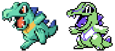
so, gen3’s shiny totodile sprite is a slightly different shade of green. it has more of a blue tint to it when compared to gen2’s. we can probably attribute this to a wider range of colours being available for the pokemon sprites. however, changes were also made to shiny totodile’s tongue, eyes, and spikes. i made a quick edit to show how a shiny totodile may have looked if we didn’t get these changes.
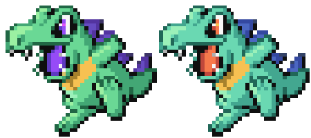
interesting, right?! i can understand the mouth change to a degree. i do really love the purple tongue, but i can understand it, you know? however, i’m pretty shocked that they made gen3+’s shiny totodile have the same red-coloured eyes as the normal form! but both designs are definitely still great, imo. in fact, they’re so great that i decided to do a whole other shiny hunt for totodile in pokemon: crystal, since i wanted the 'minty purple' totodile, too, haha! you can read about my experience doing a gen2 starter totodile shiny hunt over on this blog post. either way, i think both of totodile’s shiny designs strike a good balance between subtlety and standing out. it can be a difficult line for a shiny design to tread, but totodile does it with ease!
totodile also got a new back-sprite with gen3.

this back sprite is pretty much the gen2 one with additional shading. totodile is in the same pose and everything!
following fire red and leaf green, we got pokemon: emerald - a pokemon: crystal-esque expansion to the ruby and sapphire games. pokemon: emerald’s totodile sprites were, generally, the same as its other gen3 companions… except emerald brought back animated sprites! from this point onwards, animated sprites became a lasting trend in the pokemon game series.


similar to its pokemon: crystal sprite, totodile is shown doing a quick little dance here. this sprite really captures totodile’s energetic temperament!
generation four
next up came… generation 4! gen4 was HUGE for totodile, as we got the much-anticipated johto remake games: heartgold and soulsilver! personally, i think these were the single best remakes of any region of pokemon ever. gen4’s overworld sprite styling was the cutest imo. and they let pokemon follow us in hgss, too! they kept true to the core of johto while also adding on a lot of cool characterization choices to characters.
but before i get into hg/ss, let’s take a look at the sinnoh games!
prior to diamond and pearl's official release, some generation four sprites were leaked. scandalous, i know. in this march-august 2006 source leak, we can see an early form of what would become totodile's diamond, pearl and platinum sprite.

this leaked sprite has a LOT of similarities to totodile's generation 3 sprites. while totodile's pose has changed, it has the same notably small eyes as gen3 totodile. the colouring style is also very similar to that of gen3; in fact, it's almost identical, with very little alterations regarding the level of detail.
a new back sprite for totodile was present in this leak, too. let's take a look at it!

this back sprite differs quite a lot from the original ones that were utilized in gen2 and built upon in gen3. totodile is in a brand new pose! it's showing off a sweeping, dance-like jesture with its arms open wide... though the hand above its head is twisted a bit strangely. you can also see that the the shading and colouring style is also very much like its gen3 form.
then came the official release of diamond and pearl - and then, a few years later - platinum! all three of these games used the same sprite style for totodile. these sprites were markedly different from what we saw in the initial gen4 leaks, but they also retained some of the leaks' styling, too!


the new animation we got for gen4 totodile is quite energetic, and totodile’s edges have been smoothed out versus their gen3 and initial gen4 sprites. we lost some of the impressive footwork shown in previous titles with animated sprites, but the crouched pose we got (and which was notably retained from the leaked initial sprite!) is still very interesting and dynamic! furthermore, we can see an even more increased level of detail with totodile in this sprite style.
oddly enough, quite a few changes were made to totodile's eyes for this generation! in addition to totodile's eyes becoming bigger, the markings around totodile’s eyes also changed! as opposed to all the prior generations, the black markings surrounding totodile’s eyes became a darker version of their skin colour for gen4. you can see this illustrated very clearly in its gen4 backsprites:


pretty crazy, right? i think this change is honestly really cool, as it gives the shiny even more of a ‘special’ factor. totodile’s back sprites were also animated for the official release of this generation. i couldn’t find a clean rip of this anywhere, but these are the frames utilized in it! i think the pose that totodile is in is super cute here. these sprites differ quite a lot from the original ones utilized in gen2 and built upon in gen3, too. much like the leaked early version of the gen4 back sprite, totodile takes a moment to show off its dance moves - then opts to stand upright with a relaxed posture. they fixed the awkward angle of totodile's hand in the early sprites, too - thank goodness! these back sprites also show off the stark difference in how much bigger they made totodile's eyes from this point onwards. all the better to see us with!
heartgold and soulsilver kept the same back sprites used in diamond, pearl and silver - but they introduced a new, upright design for totodile’s other sprite!


totodile was granted its fanciful footwork once more for these sprites. the jumping animation suits it very well! like the diamond, pearl and platinum sprite, you can see that totodile’s eye markings aren’t black in these sprites, too. additionally, this totodile is a bit more… rotund than previous designs. it reminds me a whole lot of its gold sprite posture in particular, though it's a bit more wide-eyed and baby-ish. this suits it, though, since it’s a very cute little starter pokemon!
generation five
with the release of pokemon: black and pokemon: white, we entered a whole new generation of pokemon: generation 5. gen5 included both pokemon:bw and its sequel games - pokemon: black 2 and pokemon: white 2.
in all four of these gen5 games, totodile’s hg/ss sprites were reused, but they were given a different animation.


like many gen5 sprites, totodile’s sprite swayed from side to side in a constant loop during battles. this gave the battles of this gen a very lively feel! totodile also leapt up into the air after swaying around a bit, which strikes me as a little nod to the leap featured in the hgss sprites. furthermore, you can also see that the markings around totodile’s eyes continued to be a different colour for gen5!
gen5 also gave us full-body back sprites of pokemon!


they kept the same animation of the normal, front-facing sprites, too. this way, we got to see multiple angles of the same animation. pretty cool!
generations six & seven
generation 6 marked a massive change in how totodile’s sprites looked. as we entered the 3ds era, pokemon abandoned the pixel artwork style in favor of a slightly more ‘realistic’ style. this style seems to be focused on making battles seem natural vs the older, lively bursts of animation at the start of battle. in a way, they can be viewed as the next logical step from the consistent animations depicted in the generation 5 games. as such, for the 3ds games - namely, x & y, omega ruby & alpha sapphire, sun & moon and ultra sun & ultra moon - totodile got a new sprite! this sprite stayed consistent for these generations (gen6 and gen7) of pokemon.


this sprite still has a lot of character, imo - even if it’s not as flashy as some of the previous generations’ pixel animations. though it’s standing still, totodile moves quickly and flails its little arms about. it’s not quite dancing around, but there’s that nod to its energetic personality. of course, it continues to show off its teeth; it truly is The Big Jaw Pokemon. also, check out how totodile’s eye markings are back to being black, even in its shiny form! i guess totodile just wanted to try out some eyeshadow for the ds games in particular, lmao.
like gen5, we got backsprites which perfectly mirrored the normal sprites for the 3ds games.


generation eight
the release of pokemon: sword and shield ushered in generation 8, and you'd think that this would have given us the chance to see totodile on the nintendo switch... but... (sniffs)... unfortunately... totodile wasn’t included in those games! :( some new totodile artwork was included with the release of pokemon: home, though! while pokemon: home is basically a storage application for pokemon rather than a mainline game, the artwork is so cute, i think it bears mentioning here.
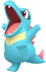
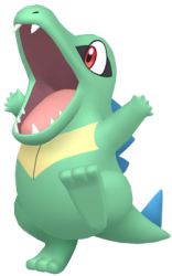
this artwork has TONS of personality. totodile’s arms are OUT, it’s standing on one foot, and it is fully showing off its chomp. you can also see the way totodile’s eye markings truly did revert back to being black.
my friend paige also did this wonderful edit of totodile’s gen2 shiny form in the pokemon: home style. it really drives home the big change they made to it, huh?
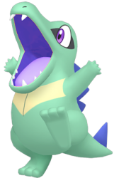
the totodile-shaped hole in our hearts was soon filled up as remakes of pokemon: diamond and pokemon: pearl were released. totodile finally landed on the switch with pokemon: brilliant diamond and pokemon: shining pearl! and, wow, did it look AMAZING.
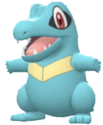
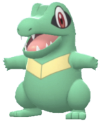
such a cute and chunky little one!! of course, these totodiles maintain quite the resemblance to their 3ds forms, except ENHANCED. the lighting on totodile was also a lot nicer thanks to the switch’s capabilities and we got a lot of different camera angles due to the very nature of the gameplay.
generation nine
following these remakes, we entered yet another totodile drought (a totodrought, one might say). totodile didn’t show up in legends: arceus, and, initially, it stayed shy for pokemon scarlet and pokemon violet. totodile fans kept hope in their hearts, however, as gamefreak began releasing 7* raids featuring the final evolved form of various starter pokemon. i wondered when it would be feraligatr's turn... and time passed. as it turns out, totodile would join us before feraligatr with the introduction of the indigo disk dlc! before, i wrote that we should wait for totodile's return and give it a big welcome whenever it showed up again - and i believe that the whole fandom did that exact thing!
with totodile's inclusion in the blueberry pokedex, we saw totodiles roaming about in the overworld. thanks to the in-game camera, i took some close-up photos of my own totodiles for this page so that we can take a close look at their models. for all of the opinions regarding scarlet and violet's graphics, i personally believe that these games did a fantastic job at introducing new models for pokemon - and, thankfully, totodile was no exception to this. there are a lot of great little details in totodile's scarlet and violet model; you can click on this picture to see the totodiles at a larger size.
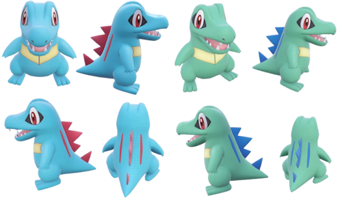
scarlet and violet gave totodile's model a whole lot of texture! check out the scale pattern all over totodile's body, and the way that those scales catch the light! totodile's back scales resemble real-life crocodile skin, too. i figure that the decision to keep totodile's front smooth is also a little nod to their real-life counterparts, as crocodiles have smooth scales on their undersides while the scales on their backs are more rigid and thick. the general departure from the more plastic-like consistency of gen8's totodiles is pretty interesting to me; it's clear that a lot of effort went into this more 'realistic' portrayal of totodile. with that said, it's interesting how, even with these elements of realism, totodile is still very much the recognizable, chunky little starter that we all know and love. in adherence to its pokemon home artwork from gen8, its colouration (in both its normal and shiny forms) stayed the same, with no sudden design changes.
luckily for us, gen9 wasn't done with the little 'dile just yet. another legends game was on the horizon, and that game brought totodile back with an absolute gusto. as if making up for the totodrought we braved during the swsh and legends arceus years, totodile was not only featured in pokemon legends: z-a...
or, erm, it was a first partner pokemon in it. haha! alongside the iconic chikorita and tepig, totodile was thrust into the spotlight! it was part of the trio of pokemon that trainers could pick as their very first pokemon at the start of their journey! let's take a look at the new model featured in plza.
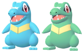
plza definitely leaned back into the more stylized, "cartoon-y" route for its pokemon models. gone are the little scales of the scarvi years...! truth be told, plza's totodile model reminded me more of the bdsp totodile model of the previous generation moreso than scarvi's. i think that totodile's overall features were sharper, though, and many of its animations in game (paired with cries of 'toh! toh!') made it seem all the more energetic and crisp. additionally, even though lighting may account for the more drastic differences, i believe that plza's totodile model was slightly more saturated. maybe if we saw totodile in swsh, we would've seen a model like this one. with that said, totodile's general colouration continued to remain consistent: there were no surprising changes in its design.
plza also introduced another type of totodile to us via... mega feraligatr?!?! while including totodile's eldest relative here might be a bit #controversial, i have to give a shoutout to the blatant ways in which feraligatr's brand new mega evolution nod towards totodile!
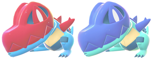
for this mega evolution, feraligatr gets a massive hood that it can swing down over its head, forming a helmet of sorts. by tucking its spiked arms in front of its body, it can make an additional 'jaw' - one reminiscent of none other than totodile!!! according to the plza pokedex, these jaws' bite is TEN TIMES more powerful than mega feraligatr's normal jaws!!! never doubt the power of Baby. i loved that feraligatr's mega included nods to its pre-evolutions, not only in the form of the obvious totodile head but also evident in it featuring an additional v-like marking closer to its chest, much like totodile's. (moreover, the spikes on its sides look just like totodile's cute little arms!)
so, there you have it! an account of totodile’s design changes through the ages of pokemon games. it’s pretty interesting to see how its design evolved over time, don’t you think?
all of the sprites featured on this page are from various pokemon games (or pokemon games that were in-progress). all of them were cropped by me for sizing consistency, but ones that i did not screenshot and edit myself were compiled from these sites:


